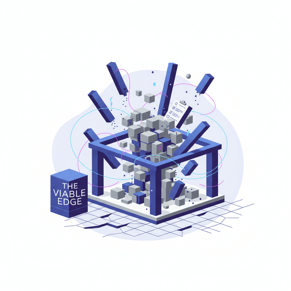
Brand consistency is one of those things nobody notices when it is working and everybody notices when it is not. It is the invisible infrastructure beneath your marketing. When it holds, your brand feels trustworthy, recognizable, and professional. When it cracks, customers sense something is off even if they cannot articulate what.
The problem is that brand inconsistency rarely happens overnight. It accumulates. A slightly different shade of blue in a social media template. A sales deck that drifts from the approved messaging. A sub-brand that develops its own visual identity without guardrails. Each deviation is small on its own. Together, they erode the brand equity you spent years building.
This checklist is designed to be a practical diagnostic tool. I have organized the 15 most common signs of brand inconsistency into three tiers: visual, messaging, and strategic. For each sign, I describe what it looks like in practice, why it happens, and the specific fix. At the end, you will find a scoring framework so you can assess where your brand stands today.
Why Brand Consistency Matters More Than Ever
Before diving into the checklist, it is worth understanding why brand consistency has become a higher-stakes game in recent years. Three forces are amplifying the impact of inconsistent branding:
- Channel proliferation: Your brand now lives across dozens of platforms, each with different format requirements and audience expectations. More channels mean more opportunities for drift.
- AI-generated content velocity: Teams are producing content faster than ever. Speed without governance creates inconsistency at scale.
- Customer expectations: People interact with polished, consistent brands daily. They have been trained to notice when something feels off, even subconsciously.
Research consistently shows that consistent brand presentation increases revenue by meaningful margins. The mechanism is simple: consistency builds recognition, recognition builds trust, and trust drives purchasing decisions.
Now, let us diagnose where your brand might be breaking down.
Tier 1: Visual Inconsistency (Signs 1-5)
Visual inconsistency is the most immediately noticeable category. These are the problems that make your brand look unprofessional or fragmented at first glance.
Sign 1: Logo Variations Are Multiplying
What it looks like: Your logo appears in different proportions, colors, or configurations across channels. The website uses one version, social media uses another, and the sales team has a third saved to their desktop from 2019. Some versions have the tagline, others do not. The icon mark appears in unauthorized color combinations.
Diagnostic question: If you pulled your logo from every platform and touchpoint right now, would you find more than two unauthorized variations?
Why it happens: Logo files get passed around without guidelines. Team members resize logos incorrectly, change colors to match a specific background, or use outdated files because they do not know where to find the current version. Vendors and partners create their own versions when they cannot find the right file.
The fix: Create a single, centralized logo repository with every approved variation clearly labeled. Include specific guidance on minimum sizes, clear space requirements, and prohibited modifications. Use a digital asset management tool or even a shared drive with strict naming conventions. Most importantly, make the approved files easier to find than the wrong ones.
Sign 2: Color Drift Across Channels
What it looks like: Your brand blue is a different shade on your website, in your email templates, on your business cards, and in your social media graphics. Hex codes do not match RGB values. Print materials use approximations instead of specified Pantone colors. Team members eyeball colors instead of using exact values.
Diagnostic question: Can every person who creates brand materials immediately access the exact color values (hex, RGB, CMYK, and Pantone) for your primary and secondary palette?
Why it happens: Color specifications live in a brand guide that nobody references. Different tools default to different color profiles. Team members pick colors from screenshots rather than entering exact values. Print vendors interpret colors differently without Pantone specifications.
The fix: Embed color values directly into your design tools. Create shared color libraries in Figma, Canva, or whatever your team uses daily. For print, always specify Pantone values and request proofs. Audit your digital properties quarterly by sampling actual color values from live pages and comparing them to your specifications.
Sign 3: Font Chaos
What it looks like: Your website uses one typeface, your presentations use another, and your social media graphics use whatever looked good to the designer that day. Font weights are inconsistent. Some materials use the correct heading hierarchy while others use body text for everything. System fonts substitute for brand fonts in emails and documents.
Diagnostic question: Is there a documented type hierarchy that specifies which fonts, weights, and sizes to use for headlines, subheadlines, body text, and captions across every channel?
Why it happens: Font licensing is confusing. Web fonts, desktop fonts, and mobile fonts require different licenses. Team members do not have the brand fonts installed on their machines. Presentation templates were created before the current brand guidelines existed. Email clients limit font options, so substitutions happen without guidance.
The fix: Document your complete type hierarchy with specific fonts, weights, sizes, and line heights for every use case. Provide pre-built templates for the most common deliverables. Specify approved fallback fonts for environments where your primary typeface is unavailable. Make font files accessible through your shared drive or design system.
Sign 4: Photography and Imagery Mismatch
What it looks like: Your website features polished, warm-toned lifestyle photography while your LinkedIn posts use cold, stock-looking images. Product photos vary wildly in lighting, angle, and background treatment. Some channels use illustrations while others use photography with no clear rationale for the mix.
Diagnostic question: Could someone identify your brand from the imagery alone, without seeing your logo or name?
Why it happens: Image selection is treated as a per-project decision rather than a brand decision. Different team members have different aesthetic preferences. Stock photo subscriptions give access to millions of options without filters. Photography direction changes with each photoshoot without referencing the brand system.
The fix: Create an image style guide with specific direction on lighting (warm vs. cool), composition (centered vs. rule of thirds), color grading, subject matter, and the ratio of photography to illustration. Build a curated image library that teams can draw from. When using stock photography, establish search filters and approval processes that enforce the style guide.
Sign 5: Template Violations
What it looks like: Brand templates exist but nobody uses them. Or worse, people use them as starting points and then modify layouts, swap colors, add unapproved elements, and save over the originals. Every department has created their own version of the pitch deck. Social media templates get resized and cropped in ways that break the design system.
Diagnostic question: If you audited the last 20 pieces of marketing collateral your team produced, how many would match your approved templates exactly?
Why it happens: Templates are inconvenient to use. They live in the wrong tools. They do not account for edge cases like extra-long headlines or unusual image ratios. Team members feel constrained and believe their modifications are improvements. There is no enforcement mechanism.
The fix: Make templates that are genuinely easier to use than starting from scratch. Build them in the tools your team actually uses. Lock down elements that should not change. Provide enough flexibility within the system that people do not feel the need to break it. Run quarterly audits and celebrate compliance rather than only punishing violations.
Tier 2: Messaging Inconsistency (Signs 6-10)
Messaging inconsistency is harder to spot than visual problems but often more damaging. When your words do not align across touchpoints, customers question whether your brand actually knows what it stands for.
Sign 6: Tone of Voice Shifts Between Channels
What it looks like: Your website copy is formal and corporate. Your social media is casual and playful. Your sales emails are aggressive and promotional. Your support communications are robotic and impersonal. Each channel feels like a different company is speaking.
Diagnostic question: If you read your website copy, a social media post, a sales email, and a support ticket response back to back, would they sound like they came from the same organization?
Why it happens: Different teams own different channels. Marketing writes one way, sales writes another, and customer support uses canned responses written by someone who left two years ago. Tone of voice guidelines either do not exist or are too abstract to be useful. Terms like "friendly but professional" mean different things to different people.
The fix: Create a voice and tone guide with concrete examples rather than adjectives. Show before-and-after rewrites for each channel. Establish a spectrum that illustrates how tone flexes across contexts (celebratory announcements vs. service disruption notices) while staying within brand parameters. Include a word list of terms you always use and terms you never use.
Sign 7: Value Proposition Drift
What it looks like: Your homepage says you help businesses "grow faster." Your About page says you help them "operate more efficiently." Your sales deck says you help them "reduce costs." Your advertising says you help them "innovate." Each touchpoint emphasizes a different benefit with no unified value proposition connecting them.
Diagnostic question: Can every person in your organization articulate your primary value proposition in one sentence, and would those sentences be substantially the same?
Why it happens: The value proposition was never clearly defined, or it was defined and then ignored as different teams optimized for their own objectives. Sales emphasizes what closes deals. Marketing emphasizes what gets clicks. Product emphasizes what got built. Each perspective is valid but incomplete.
The fix: Define a single core value proposition and a set of supporting proof points. Document how the value proposition should be expressed at different stages of the customer journey. Train every customer-facing team on the messaging hierarchy. Audit all materials quarterly to ensure alignment.
Sign 8: Inconsistent Taglines and Descriptors
What it looks like: Your company description is different on LinkedIn, your website footer, your email signatures, your press releases, and your trade show materials. You have accumulated multiple taglines over the years and different teams use different ones. Nobody is sure which is current.
Diagnostic question: Does your company have one official tagline, and is it the same tagline that appears across every platform and material?
Why it happens: Taglines change with campaigns but the old ones never get retired. The team that manages LinkedIn does not talk to the team that manages the website. Email signatures are set-and-forget. Conference materials get recycled from previous years. Mergers and acquisitions introduce competing descriptors.
The fix: Declare a single official tagline and company descriptor. Create a simple reference document listing the approved versions. Set a calendar reminder to audit all platforms and materials twice a year. When taglines change, create a sunset checklist that ensures the old version is removed everywhere before the new one launches.
Sign 9: Channel-Specific Messaging Silos
What it looks like: Your email marketing team runs campaigns with themes and messaging that have no connection to what the social media team is posting. Paid advertising tells one story while organic content tells another. The blog covers topics that contradict or ignore the positioning used in sales conversations.
Diagnostic question: Do your channel teams share a single messaging calendar, or does each channel operate with its own independent content plan?
Why it happens: Channel specialization creates expertise but also creates silos. Each team optimizes for its own metrics. There is no cross-channel messaging framework. Content calendars are managed independently. The person who runs email has never seen the social media content calendar, and vice versa.
The fix: Implement a unified messaging framework that sits above individual channel strategies. Hold monthly cross-channel alignment meetings. Create campaign briefs that define messaging across all channels before execution begins. Use a shared content calendar that gives every team visibility into what others are communicating.
Sign 10: Employee Brand Confusion
What it looks like: Employees describe the company differently to different audiences. LinkedIn profiles of team members tell conflicting stories about what the company does. New hires are confused about positioning within their first month. Internal presentations use different language than external materials.
Diagnostic question: If you asked ten employees from different departments to describe your company in one paragraph, would you get ten substantially different answers?
Why it happens: Internal brand communication is treated as an afterthought. Onboarding does not include brand training. Employees absorb brand understanding through osmosis rather than deliberate education. Leadership uses aspirational language while middle management uses operational language.
The fix: Include brand orientation in employee onboarding. Create an internal brand toolkit with approved descriptions, talking points, and LinkedIn profile language. Hold annual brand refresher sessions. Make it easy for employees to find and use the right language. When the brand evolves, communicate changes internally before they go external.
Tier 3: Strategic Inconsistency (Signs 11-15)
Strategic inconsistency is the deepest and most consequential tier. These problems indicate fundamental misalignment in how your brand operates across the organization and marketplace.
Sign 11: Audience Confusion
What it looks like: Your marketing targets enterprise buyers while your product experience is designed for individual users. Your content speaks to CMOs but your pricing page is structured for solopreneurs. Trade show messaging focuses on one industry while your digital advertising targets a completely different vertical.
Diagnostic question: Is there a single, documented audience definition that every team references when making decisions, or does each team define the target audience independently?
Why it happens: The company is trying to serve too many audiences without segmenting its approach. Growth pressure leads to audience expansion without strategic planning. Product and marketing teams have different assumptions about the ideal customer. There is no shared understanding of audience priority.
The fix: Create documented audience personas with clear prioritization. Define which audiences are primary, secondary, and aspirational. Ensure every team has access to these personas and understands how to adjust their work accordingly. Review audience definitions quarterly as the business evolves.
Sign 12: Positioning Gaps
What it looks like: Your brand occupies different competitive positions depending on who is speaking. The CEO positions the company as an innovation leader. The sales team positions it as the reliable, safe choice. Marketing positions it as the affordable alternative. Each position attracts different customers and sets different expectations.
Diagnostic question: If a prospect spoke to your CEO, a salesperson, and your marketing team in the same week, would they hear the same competitive positioning?
Why it happens: Positioning was defined at the leadership level but never translated into actionable guidelines for every team. Or positioning was defined years ago and different teams have evolved their own interpretations over time. Sales adapts positioning to match what each prospect wants to hear. Marketing tests different angles and forgets to converge.
The fix: Develop a positioning statement that is specific enough to be useful and flexible enough to adapt to different contexts. Create a competitive positioning matrix that clearly defines how you differentiate against specific competitors. Train sales and customer-facing teams on the positioning and give them language they can actually use in conversations.
Sign 13: Sub-Brand Conflicts
What it looks like: Product lines, service offerings, or business units have developed their own brand identities that conflict with or overshadow the parent brand. Sub-brands use different color palettes, messaging frameworks, and visual styles. Customers do not realize that two products belong to the same company. Sub-brands compete with each other for the same customers.
Diagnostic question: Is there a clear, documented brand architecture that defines the relationship between your parent brand and every sub-brand, product line, and service offering?
Why it happens: Sub-brands are often created by different teams at different times without a governing framework. Acquisitions bring new brands that are never properly integrated. Product teams want their own identity and lobby for independent branding. Nobody owns the overall brand architecture.
The fix: Define your brand architecture model (branded house, house of brands, endorsed, or hybrid). Document the relationship between every brand entity. Establish clear guidelines for when new sub-brands are appropriate versus when existing brands should extend. Appoint someone to own the brand architecture and enforce governance across the portfolio.
Sign 14: Acquisition Integration Failures
What it looks like: Acquired companies retain their pre-acquisition branding indefinitely. Customers cannot tell which products belong to the parent company. The acquired brand's website looks completely different from the parent brand's site. Sales teams from the acquired company still use their old pitch decks and collateral. There is no visible connection between the entities.
Diagnostic question: For every acquisition in the last five years, is there a documented brand integration plan with specific milestones and deadlines?
Why it happens: Post-acquisition brand integration is treated as a low priority compared to operational integration. There is fear of alienating the acquired company's existing customers. The integration requires investment in new materials, website redesign, and team training that nobody budgeted for. Leadership assumes "we will get to it eventually."
The fix: Include brand integration in the acquisition due diligence process. Create a standard 90-day brand integration playbook. Define transition states that allow gradual migration without confusing customers. Budget for brand integration as part of the acquisition cost, not as an afterthought.
Sign 15: Digital vs. Physical Disconnect
What it looks like: Your digital presence and physical touchpoints feel like different brands. The website is modern and polished while retail locations, packaging, or printed materials feel outdated. Digital advertising uses one visual system while trade show booths use another. The customer experience online sets expectations that the offline experience fails to meet, or vice versa.
Diagnostic question: If a customer interacted with your brand online and then encountered it in a physical environment, would the experience feel seamless and connected?
Why it happens: Digital and physical touchpoints are managed by different teams with different budgets and update cycles. Physical materials are more expensive to refresh, so they lag behind digital updates. The brand guidelines were written for one medium and do not translate well to the other. Environmental design requires specialized expertise that most marketing teams lack.
The fix: Extend your brand guidelines to cover both digital and physical applications explicitly. Create a touchpoint map that identifies every place your brand appears and assign ownership. When refreshing the brand, plan digital and physical updates simultaneously. Accept that physical materials have longer production cycles and plan accordingly rather than allowing them to fall behind indefinitely.
Your Brand Consistency Score
Now that you have reviewed all 15 signs, use this scoring framework to assess where your brand stands. For each sign, rate your brand on a scale of 0 to 2:
| Score | Meaning |
|---|---|
| 0 | This problem is actively present in our brand |
| 1 | We have partial controls but inconsistency still occurs |
| 2 | We have strong systems in place and this is not an issue |
Scoring Interpretation
| Total Score | Assessment | Priority |
|---|---|---|
| 25-30 | Strong brand consistency. Focus on maintenance and optimization. | Low - monitor quarterly |
| 18-24 | Moderate consistency with specific gaps. Address the weakest areas first. | Medium - dedicate resources this quarter |
| 10-17 | Significant brand consistency challenges. Comprehensive review needed. | High - this is impacting revenue |
| 0-9 | Critical inconsistency across the brand. Immediate intervention required. | Urgent - stop other initiatives and fix this |
How to Use Your Score by Tier
Break your score down by tier to understand where the problems concentrate:
- Visual tier score (Signs 1-5): If this is your weakest tier, start with a design system audit. Visual inconsistency is the fastest to fix because the solutions are concrete and measurable.
- Messaging tier score (Signs 6-10): If messaging is your weakest tier, invest in a messaging framework and cross-team alignment. This requires more organizational change than visual fixes but delivers compound returns.
- Strategic tier score (Signs 11-15): If strategic inconsistency is your primary problem, you need leadership alignment before tactical fixes will stick. The most beautiful brand guidelines in the world cannot compensate for a confused brand architecture.
When to Call In Professional Help
Some brand consistency problems can be solved internally with better processes and tools. Others require outside expertise. Here is how to tell the difference:
You can fix it internally if:
- The problems are primarily in the visual tier
- You have an existing brand guidelines document that just needs enforcement
- The inconsistencies stem from process gaps rather than strategy gaps
- Your team agrees on what the brand should be but struggles with execution
You need outside help if:
- Your score falls below 10
- Strategic inconsistency is your weakest tier
- Leadership cannot agree on positioning or audience definition
- You have been through an acquisition or merger without brand integration
- Multiple sub-brands are competing with each other or the parent brand
- The same problems keep recurring despite repeated internal efforts
Brand consistency is not about rigid control. It is about creating systems that make it easier to stay on-brand than to go off-brand. The best brand systems do not restrict creativity; they channel it. They give every team member the tools, guidelines, and context to represent the brand accurately without requiring approval for every decision.
Start with the tier where your score is lowest. Fix the systemic causes rather than the symptoms. And revisit this checklist every quarter, because brand consistency is not a project with a finish line. It is an ongoing discipline that compounds over time.